礼品包装盒设计时色彩技巧应该从以下几点注意:一是色彩与包装物的照应关系;二是色彩和色彩自身的对比关系。这两点是色彩运用中的关键所在。下面小编给大家介绍下礼品包装盒设计时的色彩技巧。
When designing gift boxes, we should pay attention to the following points: first, the correspondence between color and packaging; second, the contrast between color and color itself. These two points are the key to the use of color. The following Xiaobian gives you a presentation of the color techniques in the gift box design.
一、色彩与包装物的照应
First, the coloring of color and packaging.
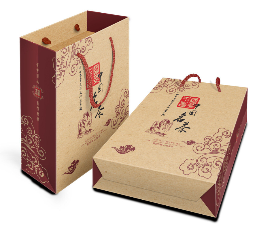
(1)从行业上进,食品包装类正常的用色其主色调鹅黄、粉红来表述这样给人以温暖和亲近之感。当然,其中茶,用绿色不少,饮料,用绿色和兰色的不少,酒类、糕点类用大红色的不少,儿童食品用玫瑰色的不少。
(1) From the industry, food packaging normal color with its main color turquoise, pink to express such a warm and intimate feeling. Of course, many of them use green tea, a lot of beverages, a lot of green and blue, a lot of wine, cakes and other red, a lot of children's food with rosy.
(2)从性能特征上,单就食品而言,蛋糕点心类多用金色、浅色给人以香味袭人之印象;茶、啤酒类等饮料多用红色或绿色类,象征着茶的浓郁与芳香;蕃茄汁、苹果汁多用红色,集中表明着该物品的自然属性。
(2) As far as food is concerned, cakes and pastries are often golden and light colored, which gives people the impression of fragrance; tea and beer drinks are often red or green, which symbolizes the rich and fragrant of tea; tomato and apple juices are often red, which indicates the natural attributes of the product.
二、色彩与色彩的对比关系
Two, the contrast between color and color.
(1)色彩使用的深浅对比。
(1) the contrast of color use.
这在目前包装设计的用色上出现的频率多,使用的范围广。所谓的深浅对比,应该是指在设计用色上深浅两种颜色同时巧妙地出现在一种画面上,而产生出类比较协调的视角效果。
This is the most frequently used color in packaging design and the most widely used. The so-called contrast between depth and shade, should refer to the use of color in the design of two shades of color at the same time ingeniously appear on a screen, resulting in a more coordinated visual effect.
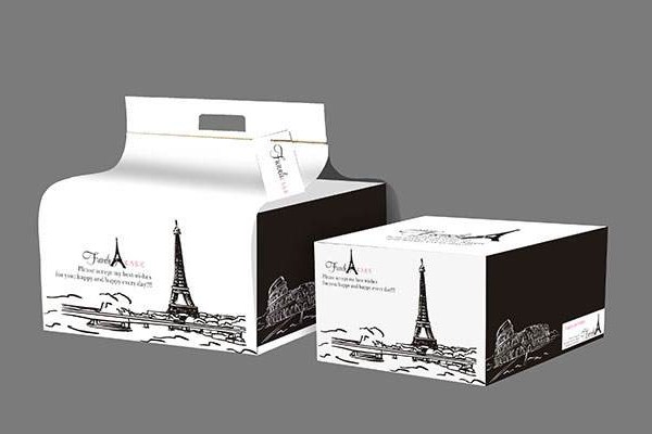
(2)色彩使用的轻重对比这在包装色彩的运用上,同样是重要的再现手法之一。这种轻重对比,往往是用轻淡素雅的底色上衬托出凝重深沉的主题图案,或在凝重深沉的主题图案中。表现出轻淡素雅的包装物的主题与名称,以及商标或广告语等。
(2) The use of color contrast in the use of packaging color, is also one of the important reproduction techniques. This kind of contrast, often with light and elegant background color foil out of the solemn and deep theme patterns, or in the solemn and deep theme patterns. It shows the theme and name of light and elegant packaging, as well as trademark or advertising language.
(3)色彩使用的点面对比(或大小对比)这种对比,主要在一个包装画面的设计过程中,使用色素上从一个中心或集中点到整体画面的对比、即小范围和大范围画面间的对比。
(3) Point-to-point color contrast (or size contrast) This contrast, mainly in the design process of a packaging screen, the use of pigments from a center or focus point to the overall picture of the contrast, that is, the contrast between small and large-scale pictures.
以上就是关于礼品盒设计时的一些色彩搭配技巧,希望可以帮助到大家。
The above is some color matching skills in the design of gift boxes, hoping to help you.